


Composition
I have been thinking about how to continue this blog while I am recovering from surgery and my traveling ability is rather limited. It might be fun to share some tips and techniques for improving our photos.
A “good photograph” is of course totally subjective, but if we dig a bit farther we’ll discover that our favorite photos all share several common elements. Today, I will start with the first criteria for a pleasing photo – composition.
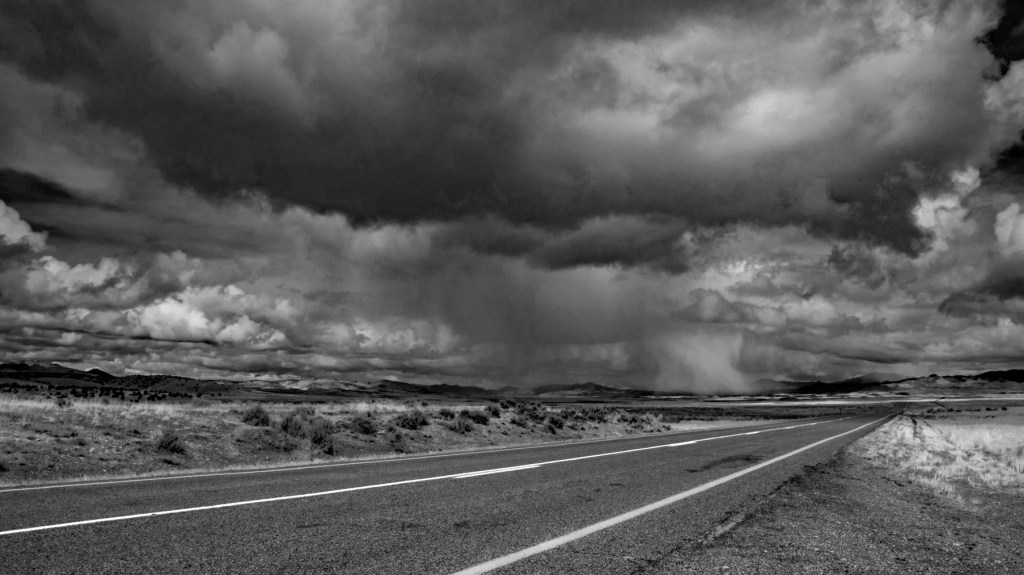
Many times we snap a photo based upon something we’ve seen on the spur of the moment. That’s exactly the case here. I was driving north on Utah Highway 257 toward Delta looking at the storm ahead, thinking about whether or not those clouds were producing rain or snow. Then I realized that there was a really nice photo in that view.
When we snap a photograph, we have seen something that we like. But to make a really good, pleasing photograph spend a few minutes thinking about what is it exactly that is inspiring you. Ask yourself, “What was it that I saw?” Take a minute to walk around the scene and look at different points of view, different angles. In every scene that we photograph there should be something that is our main subject. The creative part of our brain knows what it is, but sometimes our more conscious side needs a minute to find it.
Consider the main subject of the scene. In this case it was those storm clouds and precipitation. (It was snow, not rain, and that’s a longer story.) Now I selected this monochrome scene so that we can more easily focus on the composition rather than being distracted by the colors.
It’s natural to want to place that subject right in the middle of the frame; the center of our focus should be in the center of the photo. Or should it? That makes for a very static photo. I will explain why in a minute.
Now some of you may have heard of the Rule of Thirds. All this means is to split your view into thirds – top to bottom and left to right. Believe it or not, we can create balance by having things unbalanced and asymmetrical.

Notice where I have placed that intense downdraft of precipitation – right at the intersection of those one-third lines. Why? As photographers we want our pictures to draw our viewers into our scene, to get them to really look into the photo. By placing the main subject out of the center, it forces us to move our eyes around a bit to find that subject. This motion creates interest.
Also, notice where the horizon line is in the above photo – almost right on that bottom 1/3 guideline. Why? Again to force eye movement. I was emphasizing that incredible sky, not the ground. So, two-thirds of the photo is sky because that is really my main subject.
Once you get the subject down, then think about the other elements in the scene – what do they add or take away? Do they distract from or enhance the subject? Ideally, you’ll find something in your view to lead that viewer’s eye toward your subject – to draw the viewer into the photo.

In this case it is the road. Why? We’re humans; we all know what roads are. It’s natural to look up the road to see what’s ahead; we do it instinctively when we are driving. In this photo I have drawn lines showing where the viewers eyes travel to help emphasize my point. The main line of interest is that road until we see the that heavy precipitation. But by placing that subject out of the center, it also forces our eyes to move around looking for that subject.
This creates motion and “draws in” our viewer. Also, notice that nothing in our foreground really is all that important or even distracting. The foreground just blends right in and flows toward our subject.

The above photo is technically composed pretty well. That water tower’s tank is right there in that 1/3 spot. But this isn’t in my opinion that great of a photo. I can say that because I took it on the same trip as our first example. It’s what I call a “record shot” – I just wanted my viewers to see this cool old water tower.
So, what’s wrong with this photo? It’s exposed properly – there’s not overblown highlights or overpowering black shadows. I used the “Rule of Thirds”. Our eyes move around until they find that tower. So, what is wrong? The foreground is too distracting and too cluttered. It doesn’t balance with the subject. Is the subject the water tank on the tower or that dark tank in the center of the picture? It’s not obvious. And that fence just acts to cut us off from the rest of the photo. Again, we’re humans – fences are boundaries.
If I was a painter, I would have painted in a much better foreground for the tower. Yes, we can do that in Photoshop now too. But I think it can end up looking too contrived. I’m more old school.

This is what I saw that day in the original color.
I hope this has helped to give you a bit to ponder when snapping that next travel photo, hiking shot, or whatever. Remember that we can create balance from imbalance and asymmetry. Take time to ponder what you are seeing BEFORE snapping that shutter. Think about everything in the viewfinder – does it help or hurt the image you want?
Next time we’ll talk about exposure and dynamic range.
Thanks so much for visiting my blog, and I hope you enjoyed this composition refresher. Travel safe and have a great time!


A very helpful analysis. Hoping your recovery is swift and complete. Happy New Year!
LikeLiked by 1 person
Thanks Mitch!
LikeLiked by 1 person