

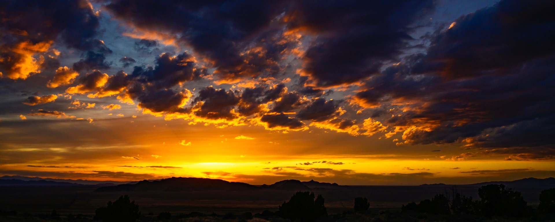
I was looking at some photos I took out in the west desert of Utah back in April of 2025 and found a couple of photos that I really loved. But I wasn’t entirely happy with either one. The originals I had processed in Photoshop Elements. Elements was a really great program, but one of its drawbacks versus the full Photoshop version was that it stored images in 8-bit color versus Adobe Photoshop’s ability to use 16-bit or 24-bit color.
Now I know this will probably only interest the true photography nerds out there (yes, I am in this group). But here is the difference. According to the great master Google, 8-bit color produces 256 color shades per channel (Red, Blue and Green). So, that makes 256 x 256 x 256 total colors, or a bit over 16.7 million. Now that seems like a lot – plenty.
However, after working with the full Photoshop now for a little over a year, I wanted to see the differences. I process my images using 16-bit color, and that makes for 65,536 shaders per channel, or 65,536 cubed total colors, or well over 281 trillion colors.
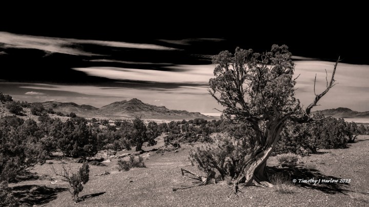
Also, I wasn’t totally happy with how my desert tree color image converted to black and white. So, I redid the actual original raw image in Photoshop, and this is what I produced. There are an almost endless variety of ways to convert an image to black and white because adding or subtracting color amounts from the red, blue and green channels vastly affects how monochrome image appears. If you want dark skies, then you generally reduce the blue amount in the conversion. Too much red will make desert ground and rocks look nearly white.
So, what I did in this conversion was first to just slightly burn in those white clouds to give them a bit of tone – before I made the color conversion to black and white. Then I used a “red filter” in Photoshop to really knock down the amount of blue coming through in the conversion. Next I bumped up the green to keep the juniper leaves from looking too black. After the conversion, I also adjusted the contrast just a bit.
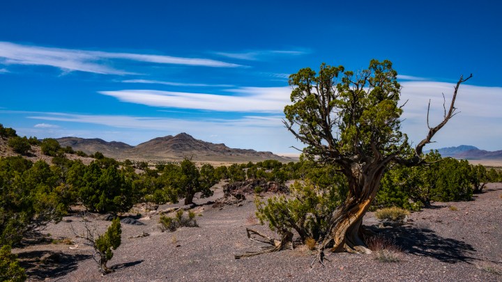
This image has been somewhat of a challenge from the get go. I shot the photo in full color, so the original does look much richer with the 16-bit color. But I thought that this was a stronger image in monochrome because it really brings out the textures, and I think it makes the desert formations more pronounced.
I like how the black and white conversion brought out the salt flats in the background just at the right of the center.
One thing that I wanted to fix in this next photo was to have it displayed in 16-bit color. I am not sure if the change is even visible on a smaller screen, and this photo is the lower resolution version at 1500 pixels tall. But if you can view it on a tablet or laptop, hopefully you’ll see the vibrant colors in those clouds.
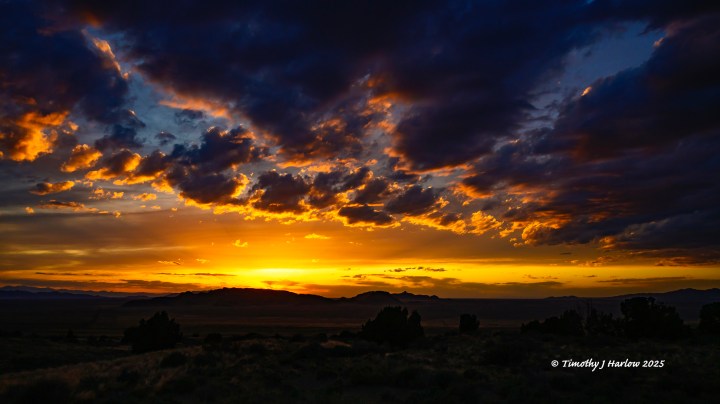
I also wanted to brighten up that foreground, so you can see some hints of detail, especially in the highlighted areas. I know this is tough to see in a small photo, especially if you are looking at it on a phone. But, if you can view it on a tablet or desktop at full size, you can see much more detail in the foreground, giving you an idea of the desert landscape. This is pretty subtle, and maybe nitpicking, but I wanted the sunset to be dark enough to see those beautiful oranges and the purples in the clouds.
So, that’s about it for today. As I continue to learn and improve both my camera skills and processing skills, it’s fun to go back and re-work some of the older images.
Thank you for taking the time to visit my blog. If you ever want to see a full size, full resolution image, just contact me, and we can get that over to you. Have a great day, and go have fun out there!


