If you have been following me for awhile, you probably know that I have been doing quite a bit of work with monochrome images lately. You may be wondering why?
When I started my photography hobby back in the late 1970s, I was working as a graphic artist in a biomedical engineering lab. I had access to their photo lab, and could use their chemicals as long as I was reasonable in their usage. My mentor (my boss in the graphics department) suggested that I start with black and white film.
He thought that I should learn the skills of working with the correct range of tones and composition before throwing in the complexities of color. Before I knew it I was studying Ansel Adams, Edward Weston, Georgia O’Keeffe and other masters.
Getting back into monochromatic images is helping me to return to the basics, honing my skills in composition and the art of making images with proper tonality. For a monochrome image to be compelling it must compete on its basic merits — strong composition to draw one into the photo, a pleasing balance, and a full range of tones from black to white to have that snap we all like known as proper contrast. And it must do this all without the benefit of adding in those wonderful colors.
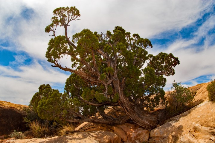
The other day while was on my computer working, I was looking at one of my desktop images that I had taken several years back while on a trip to Canyonlands National Park in southern Utah.

I really like this photograph. I got lucky that day as the sky was interesting, and the light was fairly well balanced. The little old tree was hanging on in those rocks, reaching skyward. And as you can see the poor thing sure didn’t have much soil. I shot this image looking upward toward the sky as to capture the real form of that little tree and to emphasize it’s skyward reach.
Anyway, I got to thinking as I was looking at the photo that this might be a good monochromatic image. The sky has a lot of contrast and depth, and the composition is compelling, as least in my opinion.
So, here is what evolved. How did I get this new image?

One of the things that drew me to this image besides the form was the contrast between the green juniper leaves and the orange toned rocks of the canyon. So, in my conversion I knew that I needed to retain that contrast. Also, I wanted to blue in the sky to go dark, again to contrast with the clouds.
So, after some experimentation I ended up using the infrared conversion settings with a few adjustments. I pushed the red tones downward somewhat to darken the rocks a just a little. I also pushed the green down just a hair as well. And lastly, I actually lowered the contrast a touch to keep detail in the rock highlights. In the infrared spectrum, reds look very bright, while blues tend to look very dark.
I then made a couple of minor tweaks to the brightness settings. For the final touches, I added an 81 warming filter with about a 30% density setting just to give the photograph a little warmer tone to get that “red rock” feel.
Well, there it is – my final monochrome take on that little old juniper that caught my eyes 12 years ago! I really hope you like this new version of that image, and I hope my narrative helped give you a feel of what I was trying to do. Drop me a note and let me know what you think. And for you photographers out there, don’t be afraid to experiment and push yourself.
Thanks so much for taking the time to check out my blog. Wishing you all the best!


One thought on “Juniper in the Sky”
Comments are closed.